
 themes/research-project-page.md |
 themes/dark-editorial-scroll.md |
 themes/scrolly-data.md |
 themes/experiment-dashboard.md |
 themes/aurora.md |
 themes/graphite.md |
 themes/marine-grid.md |
 themes/lumen.md |
 themes/nocturne.md |
 themes/pulse.md |
 themes/lab-console.md |
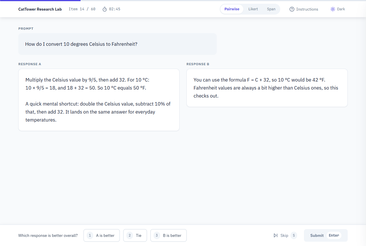 themes/eval-interface.md — text workbench |
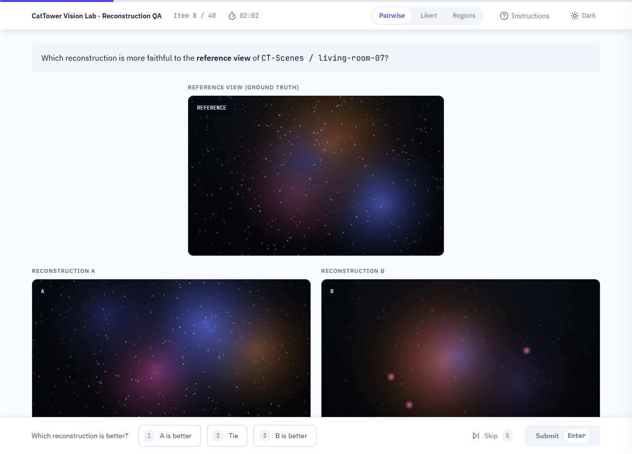 examples/eval-interface-image.html — image variant |
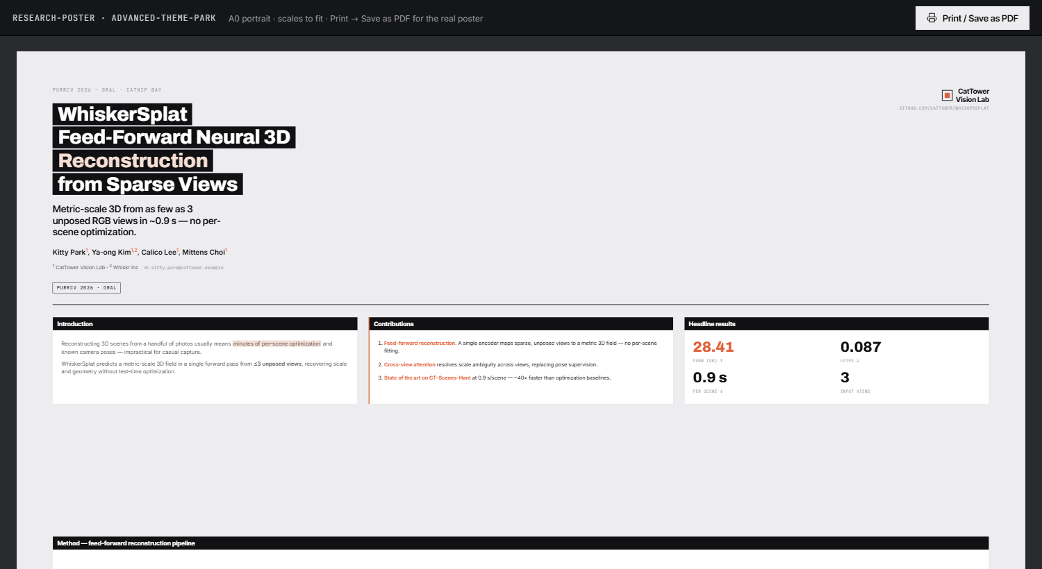 themes/research-poster.md |
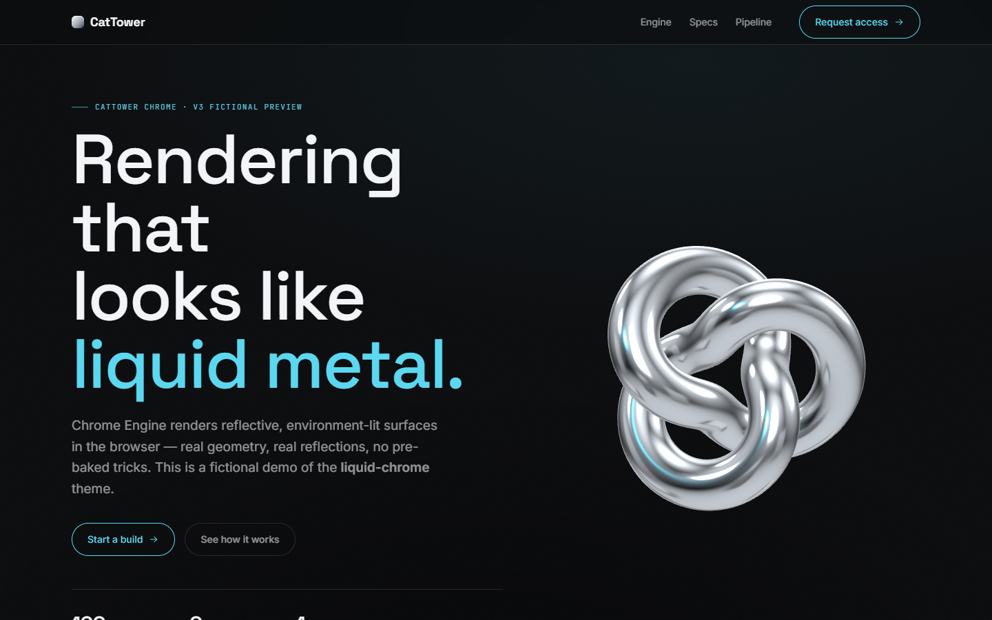 themes/liquid-chrome.md |
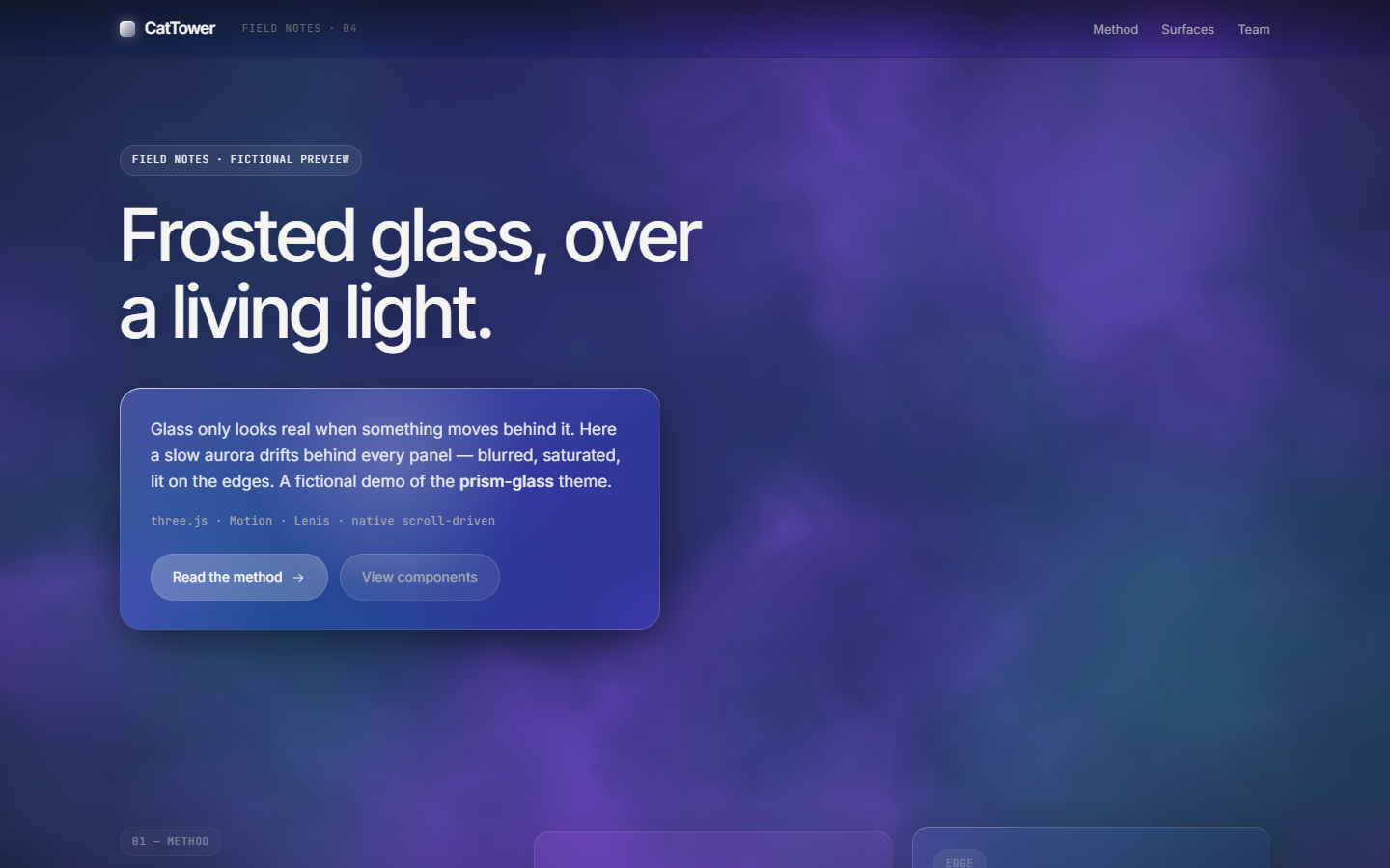 themes/prism-glass.md |